
Color is one of the main things that makes life so enjoyable. From the diverse arrays of colors in flowers to the astounding colors found on birds throughout the world, there is almost an endless amount of colors to choose from when it comes to picking your favorite.
With the infinite possibilities of favorite colors, there are also infinite possibilities for ugly colors. Color can be an incredibly subjective topic, with many people choosing favorites and least favorites based on intuition or personal experience.
Without further ado, let’s take a peek at what the world’s ugliest color truly is. We will also look at why people instinctively like and dislike colors!
What is the World’s Ugliest Color?
The world’s ugliest color is cataloged with the standardized name of Pantone 448C. In addition to this name, it also has some common names, with the most popular being “Opaque Couché”.
The color was identified by researchers working for the Australian Federal Government. The government during the time was researching colors that were naturally off-putting. This work was done to make them a requirement on tobacco labels to sway the public from getting addicted to cigarettes.
During the study (and moving forward), the color has been described as many things, such as “baby vomit,” “rotting puke,” and even “death and decay.” It is for these reasons that the Australian government forced tobacco producers to use it on their labels.
This strategy has been effective over the years and Australia has seen steady declines in regular tobacco use. It has been so successful that many other countries are following suit and requiring their tobacco companies to use dissuading label colors as well.
Why Are Pantone Colors Used For Color Identification?
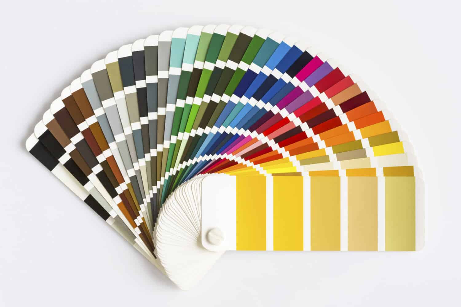
Pantone colors are like scientific names for animals. They allow anyone anywhere to denote the same color via a code!
©Victority/Shutterstock.com
As an interesting note, you may be wondering why Opaque Couché has such a robotic-sounding name as “Pantone 448C”. Its official name comes from a color-matching system known as Pantone.
The development of the Pantone system was in response to a printing industry in which every printer had a different standard for each color. This meant wherever you went, a “yellow” may have looked different between printed materials. The creation of Pantone allowed for unique names and a matching system where every printer could create the same materials! This would have been somewhat important when printing Pantone 448C on cigarette boxes.
Why Do People Find Colors Ugly?
As mentioned earlier, the process of determining what colors are “ugly” can be a rather complicated task. For instance, one person may hate purple, while others may love it. It is the subjective nature of humans and their preferences that makes the job tough!
Luckily, there are a few tools that are used to help narrow down the range of possibilities for ugly colors, in addition to in-depth testing that was done by organizations such as the Australian Federal Government.
Firstly, there are societal standards for colors that can be taken into account when determining likable and unlikable colors. Most people agree that some popular favorite colors are blues, greens, reds, and purples. Likewise, more forgotten or less appreciated colors fall within the browns, tans, and yellow-greens. This societal-wide “understanding” means that those colors that usually fall within the browns, tans, and yellow greens are more likely to be unpleasant to the general public.
We can also look at context about using color to persuade or dissuade people from using something. Context is a huge player in determining how people view colors. Hues such as that of Pantone 448C would be rather displeasing if you found it on something you were about to eat. On the other hand it could be rather soothing if it were painted on the walls of a home. There are some biological biases to colors, such as a dislike of colors that are reminiscent of mold and disease.
What Are Some Other Ugly Colors?
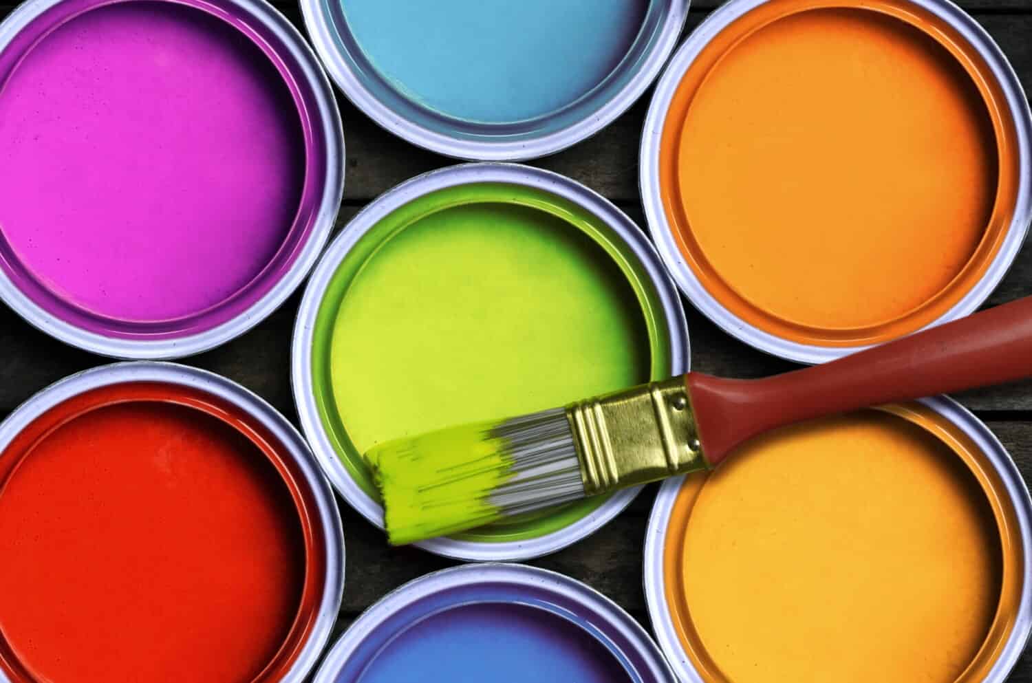
Some common colors that people don’t like include yellow, brown, and bright greens.
©nmedia/Shutterstock.com
In addition to Pantone 448C, there were a few other colors identified in the Australian study that were noted to be somewhat displacing to test subjects.
Mustard Yellow
Surprisingly, yellow was one of the main colors in the study that was noted to be displeasing to the general public. To be specific, the color in question was a semi-dark brown-yellow, which is likely the reason for its unpleasing manner.
Dark Brown
In the Australian study, dark brown came in second behind Pantone 448C. As you can probably guess, there were too many positive things associated with the color brown.
Rust
Another color that was on the list of possible worst colors was rust. Rust is a unique color that is often described as a drab mix between red, orange, and brown. As you can probably guess, the connotations of decay and unrepair are one of the main reasons why rust is not well-liked.
The photo featured at the top of this post is © Charles Wollertz/iStock via Getty Images


How to Add Us to Google News


Thank you for reading! Have some feedback for us? Contact the AZ Animals editorial team.