
Quick Take
- MiCO is the first interactive map to reveal how migratory patterns are interconnected across 109 species, drawn from 1,304 studies and detailing 1,787 sites.
- This consolidation lets policymakers coordinate across borders and accelerate conservation toward the Kunming-Montreal Global Biodiversity Framework goal of conserving 30 percent of well-connected land and marine areas by 2030.
- Migration patterns are diverse. Green turtles tend to stay within a single ocean basin for breeding and foraging, while sperm whales are more globally distributed.
With the 2025 release of the Migratory Connectivity in the Ocean (MiCO) interactive map, scientists, conservationists, and marine enthusiasts get a new glimpse into the migration patterns of more than 100 marine species.
Scientists and researchers from the University of Queensland, Duke University, Smithsonian Institution, and Global Ocean Biodiversity Initiative collaborated to create the map — the first of its kind — to show how migratory patterns are interconnected.

What Does This New Map Do?
The free, interactive map tracks the global journeys and habitats that migratory marine species navigate. More than 100 species of mammals, turtles, birds, and fish are included, as well as nearly 2,000 unique habitats.
While human interest in the migratory patterns of animals is evident as far back as the Stone Age, specific data on migratory behavior was an inexact science, at best. With the advent of satellite tags for animals, location data can now be tracked throughout the migration cycle. This gives scientists the data they need to better understand migration patterns.

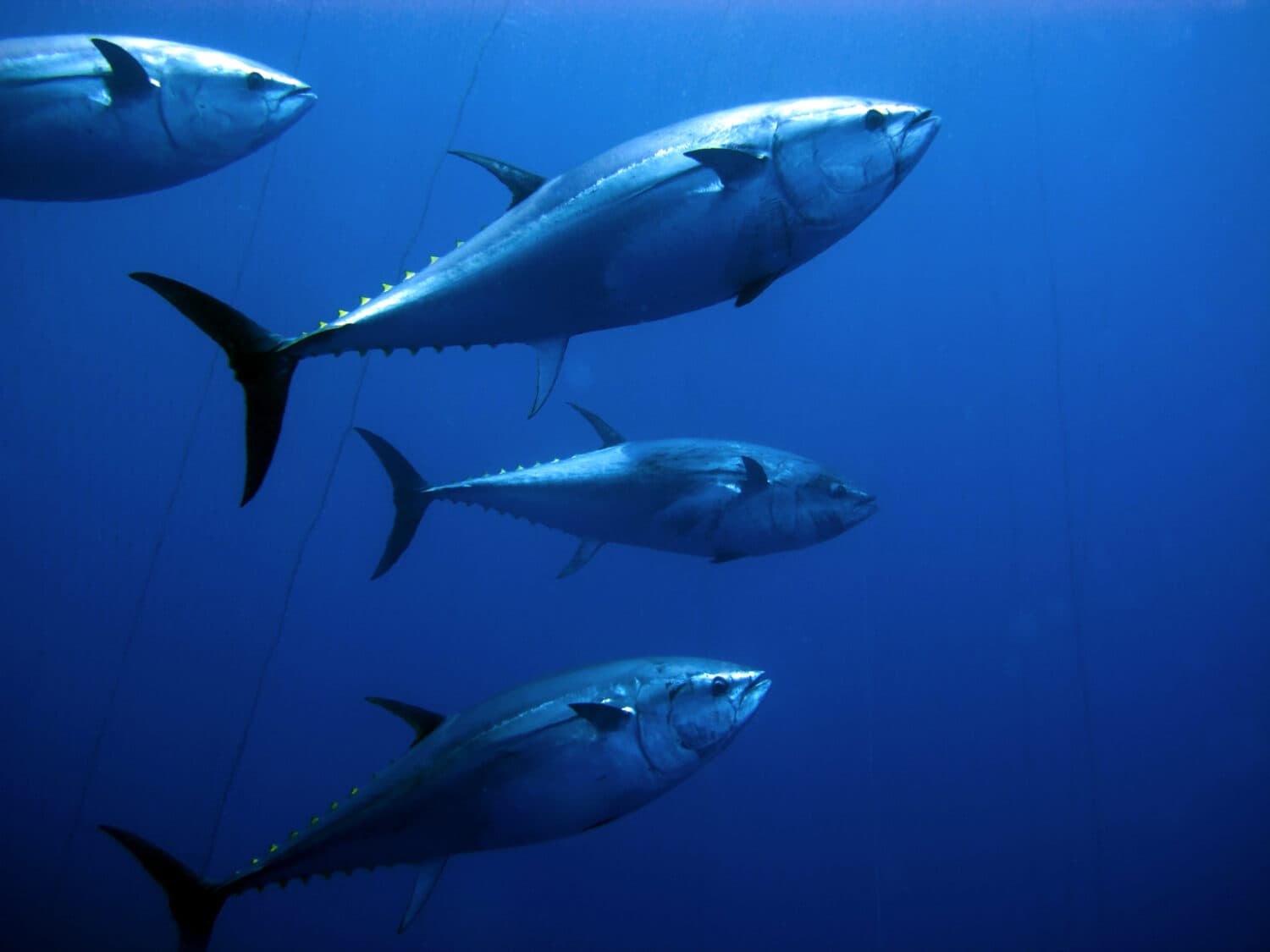
The new map shows the migratory paths of the bluefin tuna.
As a complement to the new MiCO map, researchers also put together a new study to explain their findings. The study was published on May 8, 2025.
How Did Researchers Create the Map?
To create the map, researchers synthesized data from over 1,300 individual studies spanning 1990 to 2017. The studies included 109 unique marine species. Researchers took the data, aggregated it, removed duplicate information, and visualized the data in map format to show the interconnectivity of each species’ migratory patterns. Each data point on the map links out to its original study.
The map is interactive, and the datasets can be downloaded. You can choose a specific species and view its tracked movements, whether it is contained within a specific region or across the globe.
For example, green turtles tend to stick within a single ocean basin for breeding and foraging, although they may travel hundreds of miles between the different areas. On the other hand, sperm whales are more globally distributed and travel accordingly.

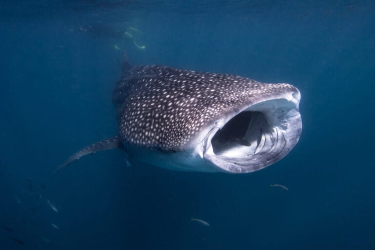
Green turtles are one of the 109 species included on the map.
©David Carbo/Shutterstock.com
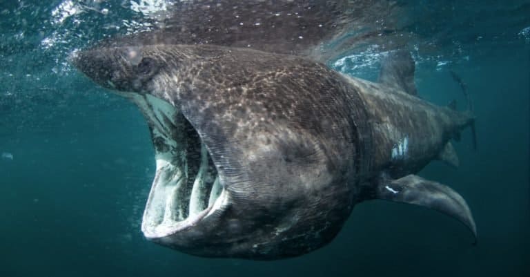
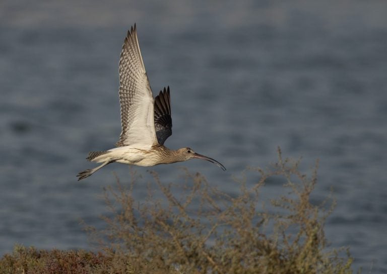
The map includes migratory patterns for diverse species, including 40 fish species, 28 marine mammals, 43 seabirds, and seven sea turtle species. Whether you want to compare Albacore tuna to blue whales, the Amsterdam albatross to the Southern Giant Petrel, or basking sharks to beluga whales, the map puts migration information and visual connectivity at your fingertips. Displaying the information is as easy as toggling on the species distribution in the map’s top menu.
Currently, the map displays data for animals in the Atlantic and eastern Pacific Oceans, primarily in North America and the Mediterranean. The map’s creators plan to add additional updates as new tracking data becomes available.
How Did Researchers Collect The Data
The map was created by using existing data from 1,304 unique studies. Researchers used this data to identify 1,787 sites and develop model migratory patterns for 109 species.
The underlying data were collected by a variety of means for each study. Often, this includes tagging an animal with a location tracking device. These devices can track tagged animal movements globally. That information is then collated and the findings are presented in each study.
It is this aggregate data that the map creators used to generate the interactive MiCO map. A full list of contributors is found on the MiCO website. Contributors range from government officials and conservation groups to national parks and universities from around the world.
Why Understanding Interconnected Migration Paths Is Important
Understanding migratory paths is important for global conservation efforts. The difficulty for policymakers and conservationists is staying on top of the multitude of published studies, then applying the data to their decision-making processes.
The map consolidates migration data for diverse species and displays it in one source location. This helps policymakers and conservationists stay on top of emerging scientific literature and quickly access the underlying data via the interactive links to the original studies. It also helps them understand how migration crosses jurisdictional boundaries. The map can be used to streamline conservation planning or management.

The migratory patterns of beluga whales are also included on the map.
©CampCrazy Photography/Shutterstock.com
Understanding migration patterns and how they are connected helps countries make informed decisions that will help achieve the Kunming-Montreal Global Biodiversity Framework‘s target of halting global biodiversity loss by conserving 30 percent of well-connected marine, terrestrial, inland water, and coastal areas by 2030.
The Map’s Impact on Marine Conservation and Policy
So far, the data provided by the new Mico map has been used by seven United Nations conventions or organizations. The map has helped shape policy and supports international collaboration among ocean-focused conservation groups.
The map’s creators hope to see their work included in the Convention on Migratory Species’ Atlas of Animal Migration when the organization convenes for its March 2026 session.